

THE new branding of a Herefordshire town has been labelled as a gimmick and designers told it looks like there is a spelling mistake.
Bromyard and Winslow Town Council was asked to apply for up to £90,000 from the Great Places to Visit fund, a pot of Government money to help areas bounce back from the coronavirus pandemic.
RELATED NEWS:
- BBC Radio 2's Jeremy Vine wades into Bromyard rebranding row
- 'Overwhelming positive response' to Bromyard backwards D project
- Masterplan to bring new lease of life to Herefordshire town
As part of that, a team from Rose Regeneration, K4 Architects and graphic designer Lucy Grafham set about promoting the north Herefordshire market town.
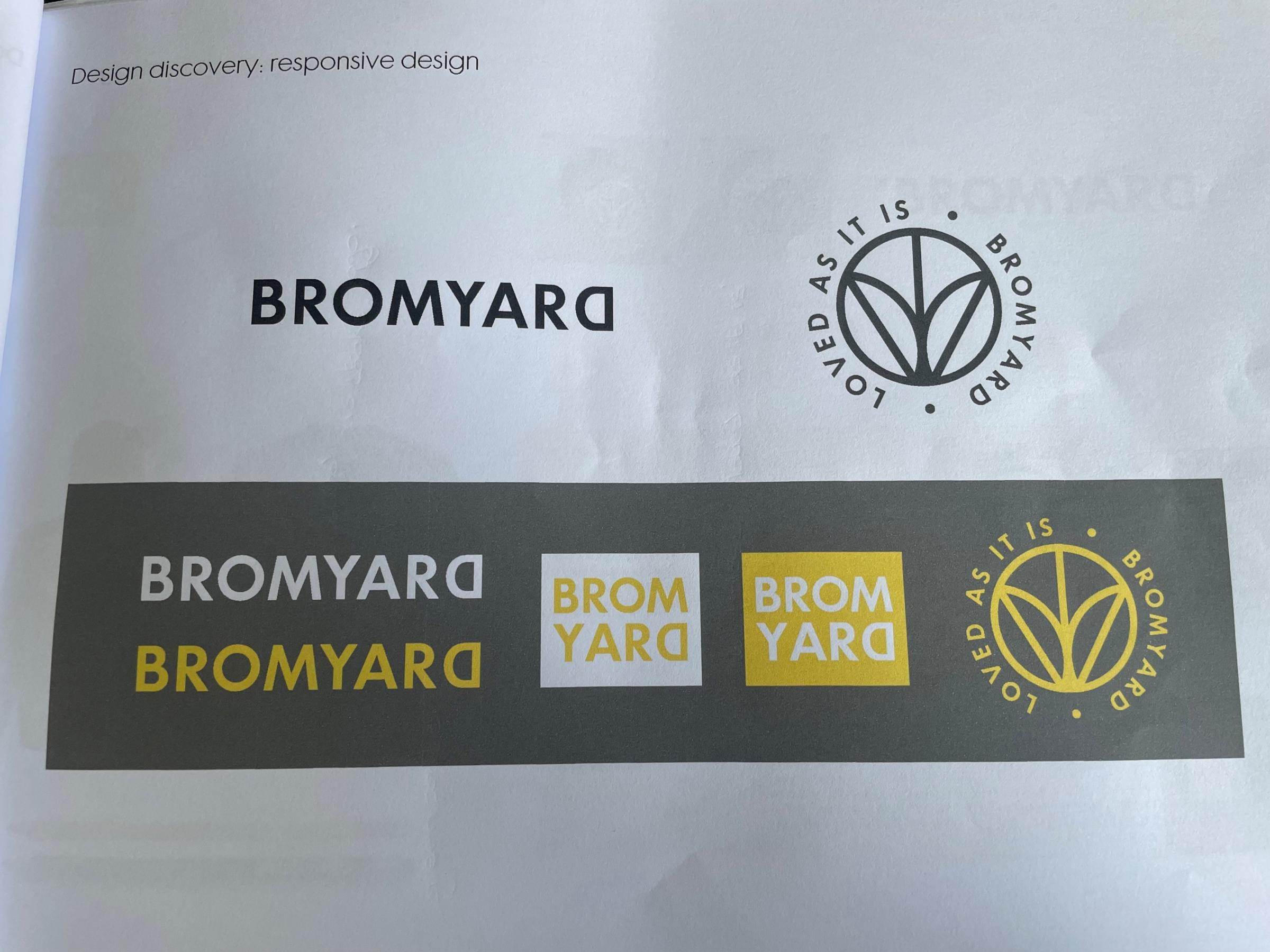
Examples of how the new Bromyard branding would have looked, complete with the 'loved as it is' strapline. Picture: K4 Architects/Lucy Grafham/Nifty Marketing
But when the designs were unveiled by Ms Grafham at a full meeting last month, one councillor said as a former teacher, she'd mark the work down for having a spelling mistake.
OTHER NEWS:
- Drunken Herefordshire attacker found walking along the A49
- Herefordshire border castle to open to the public for the first time
- Thrillseekers baffled by video of new ride at theme park popular with Hereford families
That's because the D of Bromyard is backwards, coming from a bushel in the town – made in 1670 to standardise measures in the area.
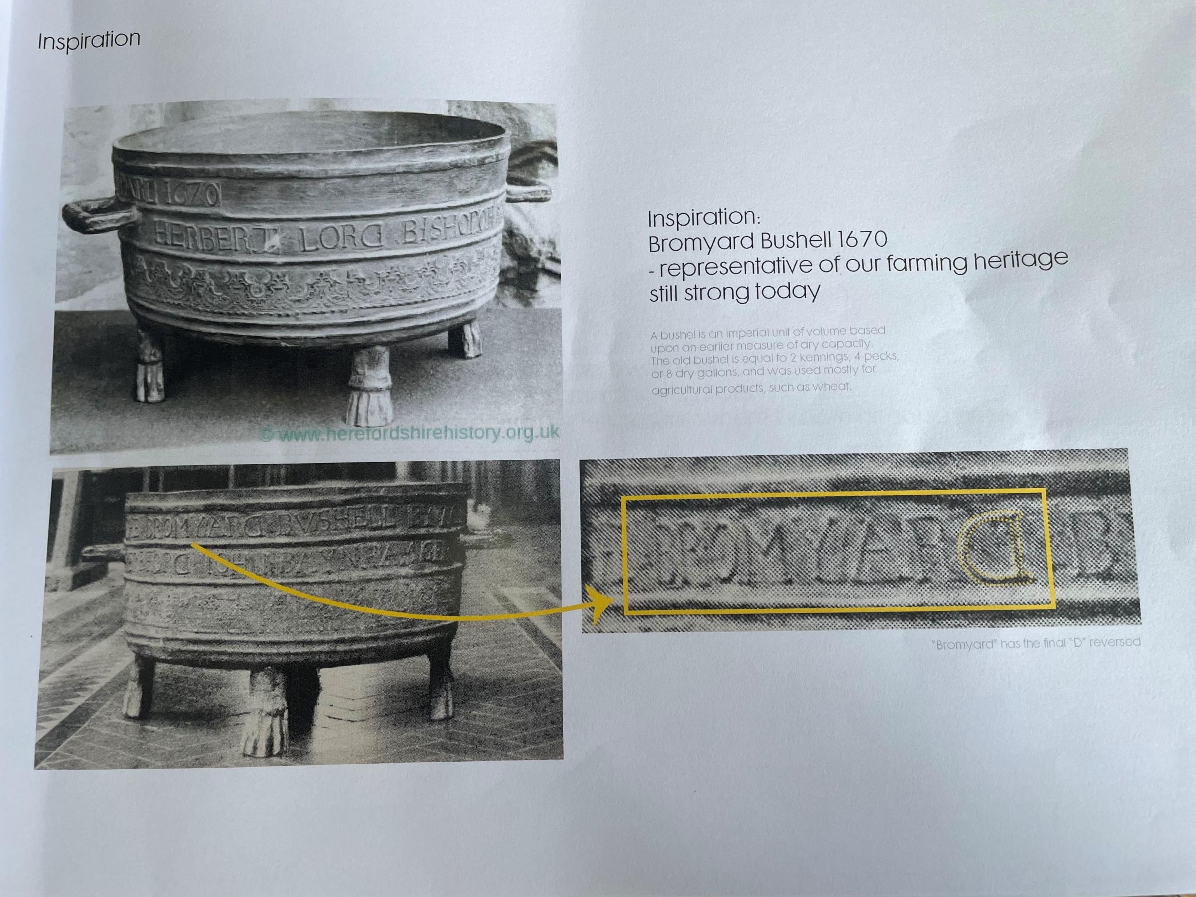
The inspiration from the backwards D came from the Bromyard Bushel. Picture: K4 Architects/Lucy Grafham/Nifty Marketing
Ms Grafham explained the reasoning behind the move, which was to keep Bromyard's history in the forefront as it looked to the future, as well as about promoting the town and making conversations.
She also said 100 per cent of people in a focus group liked it, but Coun Gill Churchill was unimpressed.
"Being an ex-teacher, I don't think the D has been explained enough in your literature why it's backwards," she said.
"That's my thoughts. I'd sooner put a red cross through it and put sp [for spelling mistake] on it."
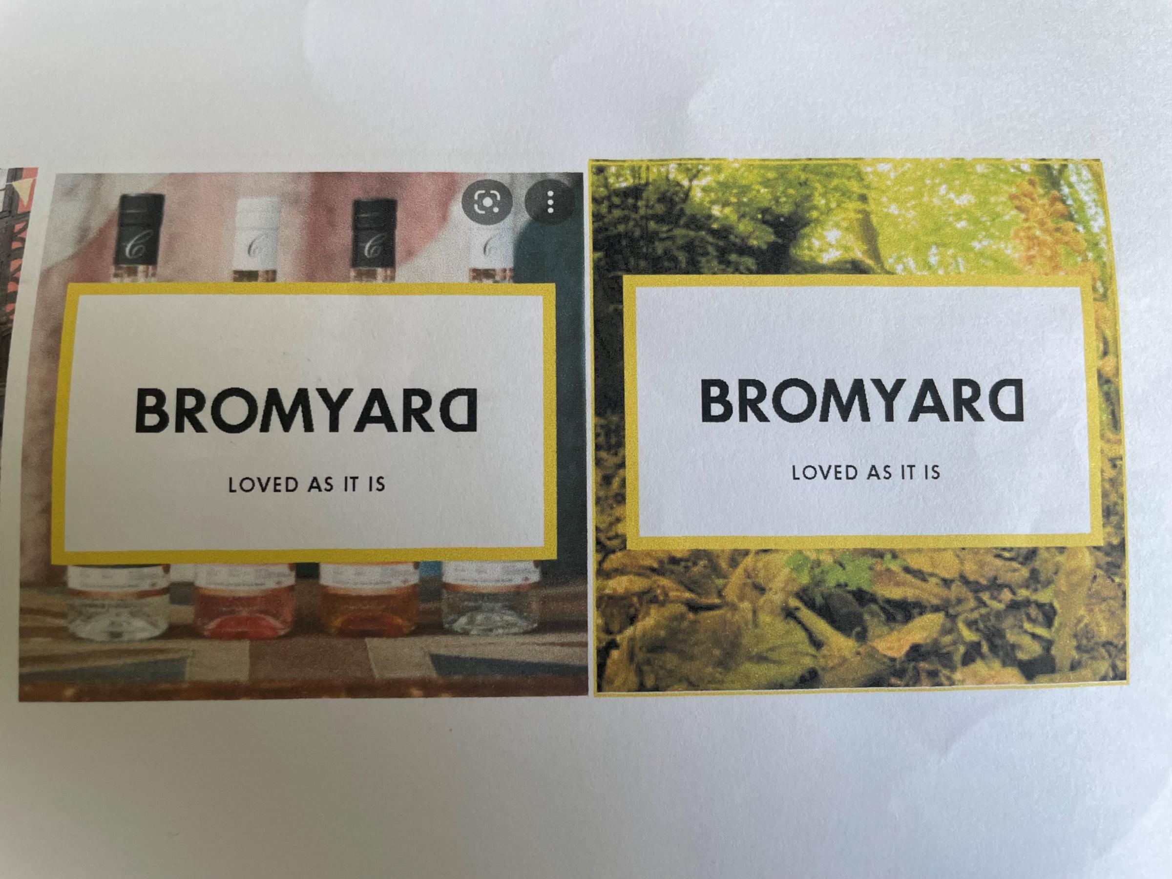
Social media examples of the new Bromyard branding. Picture: K4 Architects/Lucy Grafham/Nifty Marketing
Coun David James Smith said: "On the reversed D, which I see 100 per cent of people like, I think I'm going to make it 99 per cent.
"It's good if you know the history, the Bromyard Bushel is fascinating, but unless you know that to me it just looks like a gimmick.
"I never like seeing anything like that where the language has been mucked about with.
"If it comes in the publicity that that's why we've done it then fair enough, but if no one knows it's just another gimmick."
OTHER NEWS:
- Hereford restaurant reopens with 'new look' refurbishment
- Vikings descend on Herefordshire as battle to return stolen hoard continues
- For sale: historic hotel in the centre of Herefordshire town
Ms Grafham also came up with the slogans "loved as it is" and "Nested in nature. Heart in the community. Over 1,200 years old and still young".
She also picked out independent, authentic and rooted as three "key ideas in words".
While any decision on the branding is not yet final, Bob Ghosh, of K4 Architects, said wayfinding signage would also be a big part of the funding.
He said new signs and maps would make the town more open to visitors, with the grant funding needing to be spent by June 30.


Comments: Our rules
We want our comments to be a lively and valuable part of our community - a place where readers can debate and engage with the most important local issues. The ability to comment on our stories is a privilege, not a right, however, and that privilege may be withdrawn if it is abused or misused.
Please report any comments that break our rules.
Read the rules hereLast Updated:
Report this comment Cancel